The result for the annual Red Dot Awards is in. KaiOS has been recognized for its design excellence in the Interface and User Experience category as it enables first-time internet users to go online in an affordable and accessible device – guided with an optimized, intuitive, easy-to-use interface design.
Presented with this prestigious award is a truly encouraging achievement of the company, as it signified recognition from one of the most internationally acclaimed design competitions. The KaiOS award-winning entry is a custom-built, innovative mobile interface design responding to the needs of the next billion to encourage mobile internet adoption. Half of the world’s population is not connected to the internet, and device affordability is a critical blocker. That’s where KaiOS comes in – powering affordable, easy-to-use devices with little memory while bringing the best of smartphones with valuable digital resources.
An affirmation for outstanding user experience design to onboard new internet users
Just as exciting as winning the award is the affirmation of the team’s design approaches and capabilities to creating a user experience that has these new internet adopters in mind. Unlike other advanced or sophisticated OS designs for touch devices, the KaiOS UX team’s design vision is not solely focused on aesthetics. Ensuring the UI runs seamlessly and smoothly on a low-spec device and can be easily adapted by digitally illiterate users is a key priority while making no compromises on the good looks. The team has to go back to the basics – reimagine the barriers that new internet users may face and redesign what works for them.
The Red Dot Award recognizes good design, but it is a joint effort across all teams during the product development process to make a product functional, viable and nice-looking. It demonstrates the strong teamwork that makes the connectivity journey for the next billion easy – from discovery to actual interactions.
Stage 1 – An operating system with intuitive UI
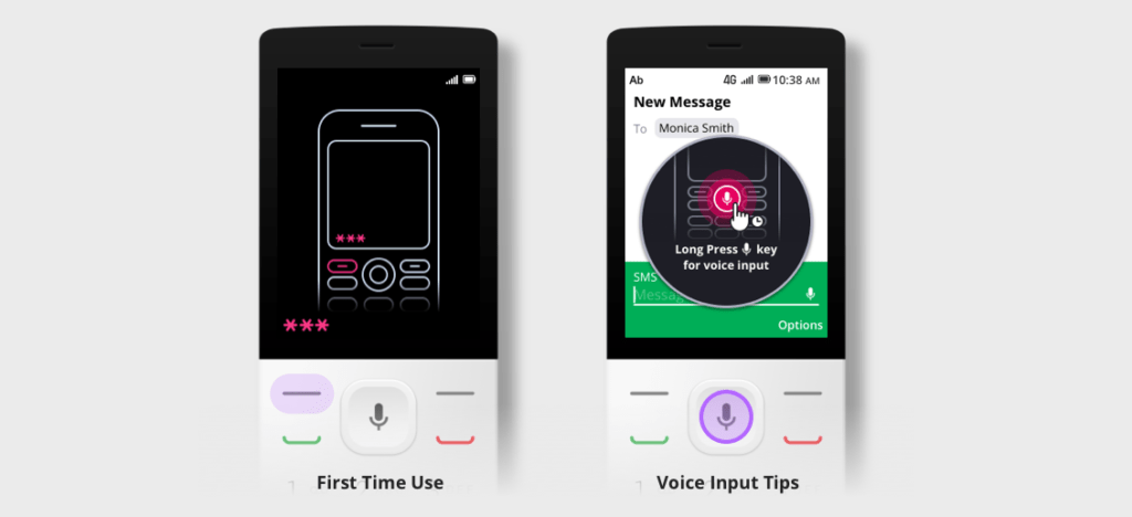
The UX team takes a minimalist design approach that helps users navigate intuitively and interact with apps successfully, even on a non-touch display with 2.4 inches. This is particularly essential for users who have never own a mobile phone or are digitally illiterate.
They are introduced to phone navigation using hardware keys in the first mobile experience, and then progressively taught how to use features such as voice input etc.
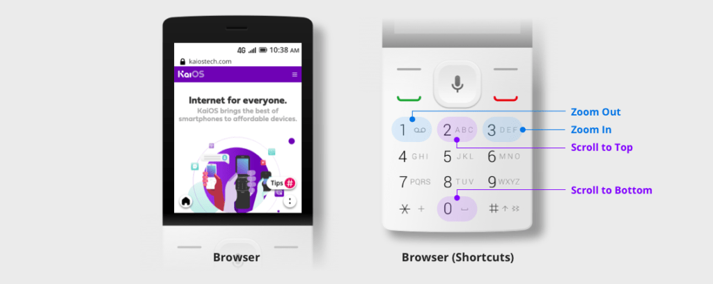
The use of physical keys is also optimized in apps such as Browser to make up for the hardware limitations.
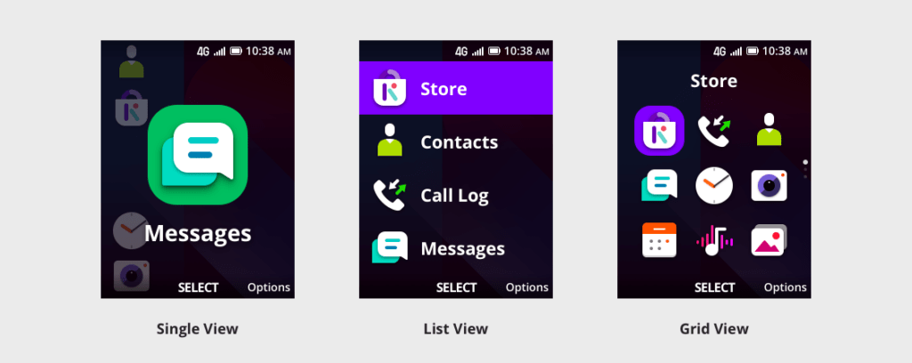
Flexibility can be seen throughout the interface design, even in the apps menu, where three designs are provided. From the simplest single view to the more advanced list view or grid view, users can decide what works best for them.
Stage 2 – Onboarding tools and features
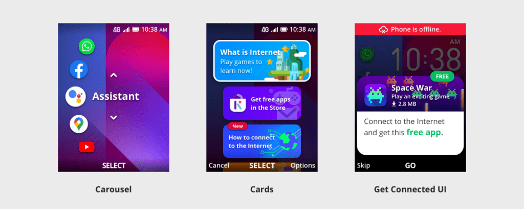
The thoughtfully designed home screen is enhanced with a carousel design which provides direct access to apps that can be selected simply by pressing the keypad. This streamlined experience makes it easier for users to find the apps they use most frequently.
Cards design on the home screen is another useful feature. It provides step-by-step guides to users on how to connect to the internet with contextual information that can effectively assist users in discovering what the internet has to offer.
Get Connected UI is created as a friendly prompt to remind users when an internet connection is needed. It motivates them to engage with digital content regularly to help them develop the habit of making the best use of the internet.
Stage 3 – Useful content in KaiStore
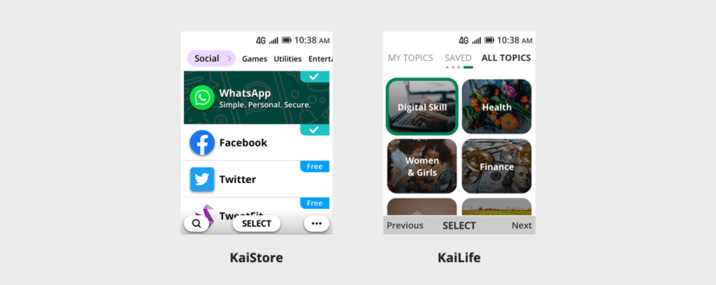
Having an interface and onboarding tools that allow the user to browse, navigate, and search effectively and efficiently, now it’s about providing useful and relevant content. KaiStore, a store of apps with a wide variety of app titles, is now possible on feature phones. There are the world’s most popular apps such as WhatsApp, Facebook, YouTube, Google Maps, etc., and also locally relevant content including some in-house apps such as KaiLife, with a directory of curated content in categories, from agriculture, digital skills, financial inclusion, to the most up-to-date health topics such as COVID-19.
Not only focused on developing in-house apps, the UX team continues fine-tuning the KaiStore experience that ultimately improves usability. For example, making it easier to find good content with related apps in search, or creating loading animations to make them visually intrigued while waiting for an app to load.
Publication of the award-winning products
There are many more to it. Be sure to head over to The Red Dot online exhibition and learn more about our winning project.
Exhibition duration: 13 November 2021 – 9 January 2022
Want to meet the masterminds who build this intuitive ecosystem? Check out our design journey and explore with us the UX design for the next billion → Design at Kai Medium.
Comments